As I sat on a bench in the Musée Marmottan Monet in Paris this summer, I experienced a moment of clarity: white is not white. Now, before artists and designers roll their eyes in unison, believe me—I understand that this revelation is far from groundbreaking and that those in the creative fields have been shouting this for years. But allow me to elaborate on how this seemingly simple idea applies to creating effective book covers.
While wandering through the museum, I paused to admire a painting depicting a serene winter scene. Leaning in closer, I was struck by the realization that the snow was not the pure white I had always envisioned. Instead, I noticed a spectrum of colors—blues, grays, even subtle peaches. We’ve been conditioned to accept the notion that snow is white. The Brothers Grimm and Disney reinforced this concept with Snow White and the Seven Dwarfs. However, the truth is far more complex: reality is nuanced, just like our perception of color.
This complexity lies in the workings of our brains. Design is both an art and a science—a blend that is often overlooked in favor of the artistic side. To understand this better, we must acknowledge that much of the brain’s processing occurs outside our conscious awareness. Our brains can process about 11 million bits of data per second, yet only about 40 of those bits translate into conscious thoughts. This disparity is crucial to understanding how we perceive the world and make decisions.
Throughout our lives, marketers and salespeople have not just been engaging our conscious minds: they have been communicating with our unconscious minds. Yes, even those of you who pride yourselves on being rational thinkers often make choices swayed by emotion. Gasp! I know.
Consider the typical shopping experience. You walk into Target with a list of five items yet somehow emerge with a cart overflowing with merchandise you hadn’t intended to buy. “I don’t know why I got all this stuff,” you might say in disbelief. Well, neuroscientists and neuropsychologists understand why. Studies show that our unconscious desires and emotional responses drive many of our choices, often leading us to purchase items that we didn’t plan on buying. We can leverage that phenomenon for book sales through intentionally designed covers.
Of course, questions arise: How takes a cover beyond merely being deemed “cute” to being recognized as “impactful”? What elements make a book cover resonate deeply with potential readers?
First, let’s explore the psychology of color. Each hue evokes distinct emotions and associations. For instance, red can signify passion or danger, while blue often conveys calmness and trust. When designing a book cover, understanding these emotional responses is crucial. A cover that effectively communicates the genre and tone of the book while evoking the right feelings in potential readers can lead them to pick it up and delve into its pages.
Next, consider composition and imagery. The arrangement of elements on a cover can create a narrative triggering an emotional response before readers even peruse the back cover. A well-composed cover draws the eye, guiding potential readers’ focus and sparking curiosity.
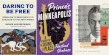
Let’s take a look at Stephen King’s book Holly. Of course, King’s brand of horror is so well-known and consistent that the mere sight of his name can evoke interest, triggering readers to buy. But there’s more going on here.
The use of color is striking. When you look closely at the cover, you’ll notice the dark blues and blacks that are often used in the horror genre. And the designer used yellow so cleverly: the significant contrast between the dark background and the yellow makes the yellow stand out. Looking at the shadowy figure in the upstairs window and the figure down below (you can tell just by
looking at that house that it’s not a finished basement with a game room—Victorian house
basements have secrets), the question becomes: which figure is Holly? More importantly: which isn’t? Am I the only one who wanted to shout “Nope!” the minute they saw this cover? That emotion is triggered by all the information being consumed by the subconscious.
But the part that made me want to applaud was the porch light—yes, even a detail as small as a porch light. Symbolically, a lit porch light is meant to welcome visitors to the house. The reader is subconsciously welcomed into the story that King built. And how can they accept that invitation? Buy the book. All of this happens before readers even crack the spine.
Next, let’s look at the cover of Disruptions by Steven Millhauser. This cover brilliantly speaks to the subconscious mind. Humans are hardwired to recognize patterns, and, as such, we also recognize disruptions to those patterns and zero in on them. Readers’ eyes tend to scan blocks of content but pause at bullet points. Why? Because they disrupt the pattern.
In this case, the images of eyes with black pupils create a pattern guiding the viewer to the outlier: the green eyes. Every time the pattern is disrupted within a busy cover, our eyes pause and allow us to absorb information such as the title and the author’s name. Have you ever walked down the street and noticed everyone staring in one direction and then turned to look in the same direction? It happened to me this summer while I was minding my own business on my way to visit the Sacré-Cœur basilica. I saw a group of people staring to the right, so I stared, too. A few minutes later, I stumbled upon an Olympic cycling event.
This cover leverages crowd behavior to make the reader stare at the outlier, which in this case is the pair of green eyes. The question becomes: why? The curiosity ignited by this cover can only be quenched by purchasing
the book.
There are numerous ways that psychology can be leveraged to engage buyers. Color and composition are just the tip of the iceberg. As publishers, we want to position books for success. To do that, we can yank a page out of the playbook used by marketing and sales professionals: by speaking more to the subconscious brain, designers can trigger an emotional connection to get books into the hands of readers.
Sierra Kay is an indie author and a consultant for public relations and marketing technology.