Readers with a keen eye for book cover design are likely to associate uniform jacket schemes primarily with boutique literary publishers—among them Archipelago Books, Fitzcarraldo Editions, McNally Editions, New York Review Books, and Wave Books, where the vast majority of titles are packaged using a distinct visual layout. Such decisions, said Nathan Rostron, associate publisher at McNally, allow a small press to instantly convey its identity. “When it comes to marketing,” he explained, “the unified cover design is for the most part a strength: instant recognizability.”
One new press to take note of this cover strategy is not quite like the others: 831 Stories, a marketing-savvy “romantic fiction company” launched last year by Erica Cerulo and Claire Mazur. The press is distributed by Simon & Schuster and has partnered with fellow startup Authors Equity on production, and has already generated buzz for its unique combination of swoony stories, plot-corresponding merchandise, and additional reading material published on its website—including epilogues, officially sanctioned fan fiction, spin-off short stories, and recipes. It has also made an impression with the uniform cover design on its slim, purse-size paperbacks.
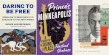
Each 831 book features a geometrically blocked cover in two distinct colors and is emblazoned with the imprint’s cupid colophon, setting each apart from others in the romance cover landscape du jour. Its latest release, for instance, Lana Schwartz’s Set Piece, employs fuchsia and hunter green—as does its associated merchandise, which includes a baseball cap, key chain, stick lighter, and sweatshirt designed in similar hues and with cheeky textual references to the novel.
“We wanted it to resonate with romance readers, but we also wanted it to stand out,” Mazur said. “Anyone who has ever approached the romance section of a bookstore knows the assault of joyful colors that you see as soon as you get to that section. It needs to sit easily with that. It needs to harmonize with that. Then, with the actual designs, we started to take some inspiration from the Danielle Steel and Judith Krantz era of romance.”
To create the jacket scheme, 831 worked with design company C47 Creative, whose executive creative director, Phil Chang, has known both Cerulo and Mazur for more than a decade and had been waiting for a chance to collaborate on a project. C47’s designers, Mazur said, intuitively understood how to appeal to eagle-eyed fans through unorthodox choices. “They built in this Easter egg, which we love. The color-block grid breaks down to an eight-three-one ratio.”
Cerulo added that the gold embossed cupid colophon at the top of every cover, whom they call Beau, has the numerals 8, 3, and 1 hidden in him. “His little belt is an 8, his bow is a 3, and his arrow is a 1.”
Chang said the color blocking used for Krantz novel covers in the 1980s and ’90s came up early in discussions with Cerulo and Mazur. “Our idea was, let’s take what we really love about Judith Krantz and synthesize that with our expertise in fashion branding and things that are supposed to be positioned as lifestyle goods.”
While branding was top of mind, Cerulo and Mazur also hoped that the design would help attract new romance readers, along with those who are squeamish about reading novels with certain types of covers in public. “Even people who are fans of a ripped bodice cover don’t necessarily want to read a ripped bodice cover on a plane in a middle seat,” Cerulo said. “In addition to being voracious readers, that’s part of why romance fans were such early adopters of e-readers and audiobooks: to be able to consume more discreetly. We like that our books offer that discretion as well.”
On the other hand, Mazur explained, having a standard cover scheme also serves as a signal to other fans. “There’s such a growing audience of romance readers who proudly read this stuff. And to have our books signifying to other romance readers like, Hey, I’m one of you, is the flip side that works well too.”
The absence of any character depictions on the cover was another important factor behind the design choice. Cerulo and Mazer explained that, without a cover model or illustration, picturing a book’s characters is left up to the imagination of each reader, without any preconceptions influenced by the packaging.
“In the books we publish, we try to be pretty thoughtful about not describing the aesthetics of a person—whether it’s our narrator or it’s the love interest—so that people do have more flexibility,” Cerulo said. “We prefer when authors are homing in more on physical tics and characteristics, and the ways people move through the world, rather than their build.”
Last summer, as Charli XCX’s Brat album and Taylor Swift’s Eras tour dominated the zeitgeist, Mazur realized the important role color schemes play in the cultural subconscious, and has since tried to use this insight in 831’s own color-related marketing efforts. “We market them like album releases, because we do things differently than typical publishers, and we have cohesive brands,” she said. “We want everybody to focus on one release of ours at a time, and how you really give each thing its moment in the sun. Going hard at the color stories helps people know what era we are in.”
While those “color stories” also tie in to merchandising, Cerulo and Mazur stressed that ultimately, their focus was on the aesthetic of the books. “One of the big inspirations was Penguin Classics and how those look lined up in a row, and the way that so many romance readers on TikTok are lining up their Emily Henrys or Ana Huangs, wanting to see how they look together,” Cerulo said. “We love the idea of not only this uniform aesthetic, but these stripes of spines that would have this bright and bold pop on a shelf.” Plus, she added,“if somebody has an 831 book on a beach, you’re going to be able to see them a hundred yards away.”
With 831’s first anniversary coming later this year, Cerulo and Mazur are starting to discuss what future covers from the press might look like, and how to keep the design fresh for readers while sticking within the blueprint. “The one thing that will always be consistent no matter what is the 831 grid,” Mazur said. “The thing we say about romance all the time, and it’s true of our covers too, is that the constraints of a formula offer up so much creative opportunity. That’s true of the stories. That’s true of our cover systems. So what you do within the constraints of that—the sky’s the limit. It’ll still look like us.”