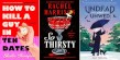
This month, Michelle Argyle at Melissa Williams Design reimagines the cover of Stingers by Graham Downs, who praised the new cover, saying, “It encompasses the story so well.”
Design Note #1: The picture of a boy with a bloody nose helps get across the idea that this is a story about bullying. The original cover struggles to convey this.
Design Note #2: Short titles are nice in that you can do a lot to make them large and stand out. I decided to use a tall, thin font to maximize space. At the same time, the aged texture lends a gritty, punchy feel to the overall tone.
Design Note #3:I wanted the title to be the first thing the reader notices. I accomplished this by superimposing a blurry, larger portion of the boy’s skin tones over the title.
Design Note #4: I like to follow the rule of thirds. I kept the boy’s eye (one of the focus points of the cover) more toward the right, creating a good balance with the title. This also allows the title to be the main focus of the cover.
To submit a book for a free cover redesign, email us at booklifeeditor@booklife.com.
Original Cover