Digital browsing now shapes how most readers discover books. That means your cover has to make an instant impression—often at thumbnail size. Bold, readable typography, high-contrast colors, and a clear focal point help it stand out across Amazon listings, newsletters, social feeds, and everywhere readers browse for new books.
For indie authors, designing with the digital realm in mind isn’t optional anymore—it’s the quickest way to make a memorable first impression and invite readers into your story. Most readers now encounter book covers first as thumbnails, not full-size images. High-impact covers rely on clarity, contrast, color, and strong focal points, and digital-first design helps indie authors stand out in online stores, ads, and book giveaway campaigns.
A standout cover does more than look good—it has to stop the scroll. Whether working with a designer or designing your own, prioritize contrast, clear typography, and imagery that instantly communicates what your book is about.
That’s why the covers in this edition of Cover Crush rose to the top as we searched through BookLife reviews and PW reviews of BookLife titles. Each author shares what inspired their design, the story behind the visuals, and how thoughtful collaboration led to covers built for impact at any size.
Expressive
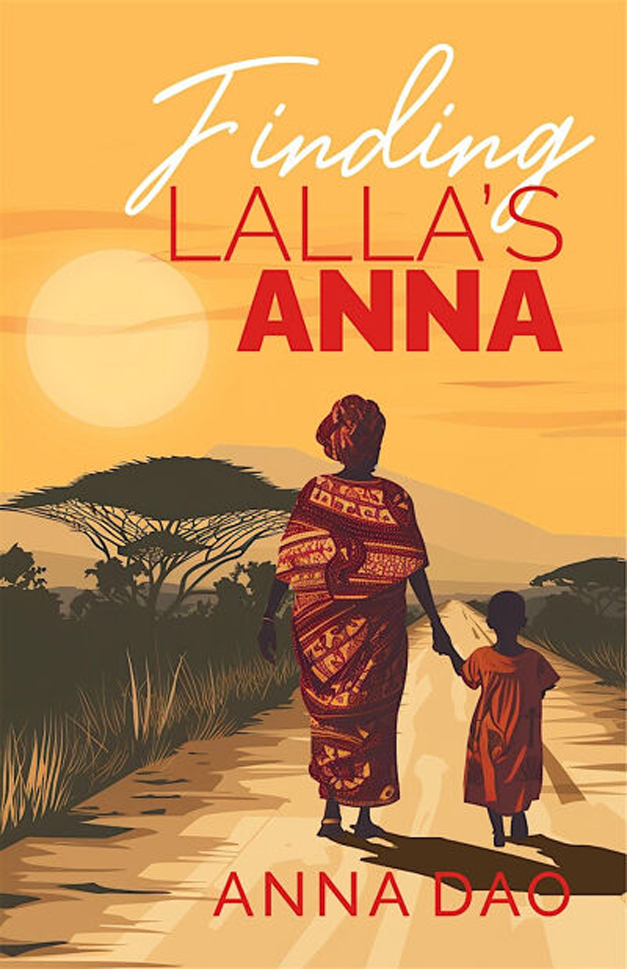
Finding Lalla’s Anna
Author’s statement: “My publisher Wordeee’s design team created a warm, luminous cover for Finding Lalla’s Anna that reflects the emotional depth of my memoir—a transformative journey of self-discovery shaped by the unconditional love and wisdom of my late grandmother, Lalla. and the ancestral teachings of my home country, Mali. The design feels original and inviting, helping it stand out online and immediately draw readers in.”
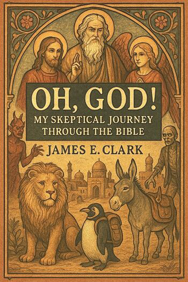
Oh, God! My Skeptical Journey through the Bible
Author’s statement: “The cover captures the book’s: reverence for the Bible’s cultural and historical weight, combined with sharp humor and a willingness to challenge traditional ideas. The artwork nods to medieval religious imagery, then adds a donkey and a penguin with a backpack, because this journey is anything but ordinary.”
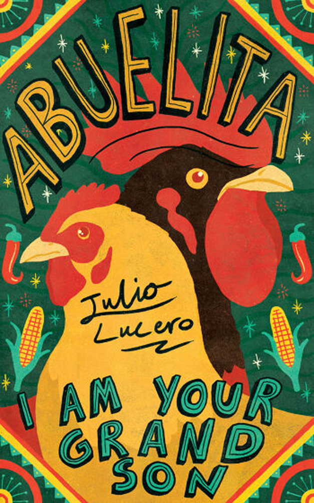
Abuelita, I Am Your Grandson
Author’s statement: “Initially I felt a chicken and rooster were essential for their cultural and familial resonance, especially in capturing frames of the restaurant life. Combined with Baris Sehri’s taste and sixth sense for color, the result is a pitch-perfect harmony of playful and sentimental.”
MINIMALIST
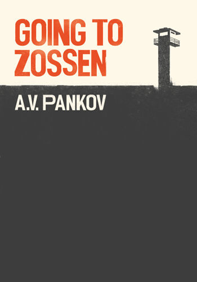
Going to Zossen
Author’s statement: “There are a lot of boxes to tick when designing a cover—genre suitability, aesthetic appeal, text readability. I really enjoyed this journey of creating, with the help of David Hennessy, a cover that intrigues, reveals, and attracts readers at the same time.”
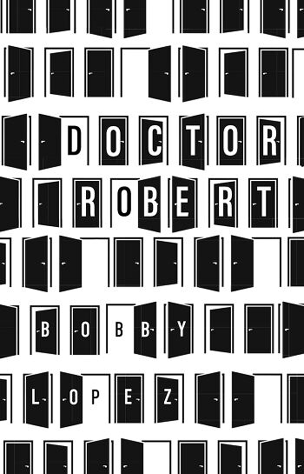
Doctor Robert
Author’s statement: “Clair Fink’s cover for Doctor Robert drew inspiration from Hitchcockian suspense and classic noir minimalism. The repeated doors create a sense of movement and psychological tension—inviting readers to question what’s hidden behind each one.”
COLLAGE
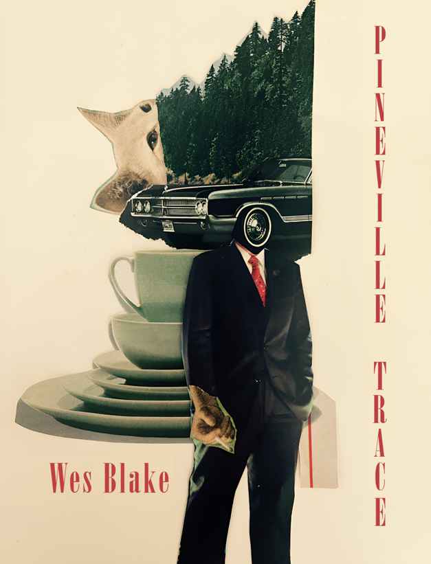
Pineville Trace
Author’s statement: “When University of Indianapolis’s Etchings Press began work on the cover for Pineville Trace, my editor Kevin McKelvey and designer Abigail Bailey partnered with Louisville artist Erik Rust to create something striking and true to the novel’s atmosphere. Everyday objects like coffee mugs nod to midcentury Americana, while surreal touches hint at Frank’s restless inner life.”
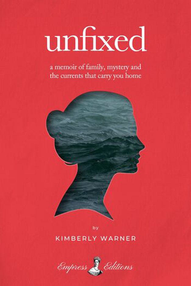
Unfixed
Designer’s statement: “Designing the cover for Unfixed was uniquely personal—I’m married to the author and witnessed the very journey she shares in her memoir. To the world, Kimberly appeared calm and composed, but I knew the storm beneath the surface. Capturing that contrast became my goal.”
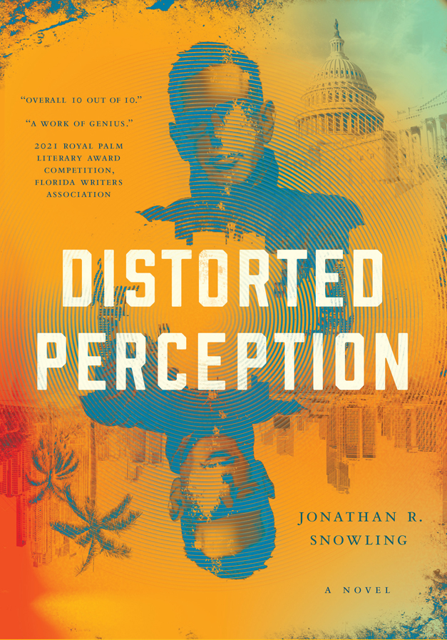
Distorted Perception
Author’s statement: “From the outset, the cover was designed with digital audiences in mind—bold contrast, sharp typography, and layered depth that would ‘jump off the screen.’ The fractured imagery reflects the novel’s central themes of propaganda, perception, and truth distortion, creating visual intrigue even
at a glance.”
PAINTERLY
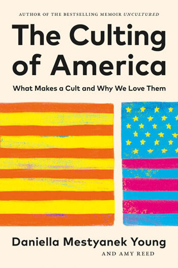
The Culting of America
Author’s statement: “The pop art-inspired cover features split flags, bold colors, and textures
that reflect how cult dynamics are woven into the fabric of American identity. From the beginning,
we wanted to show a brighter and more diverse America alongside the reality of our current fractured American identity.”
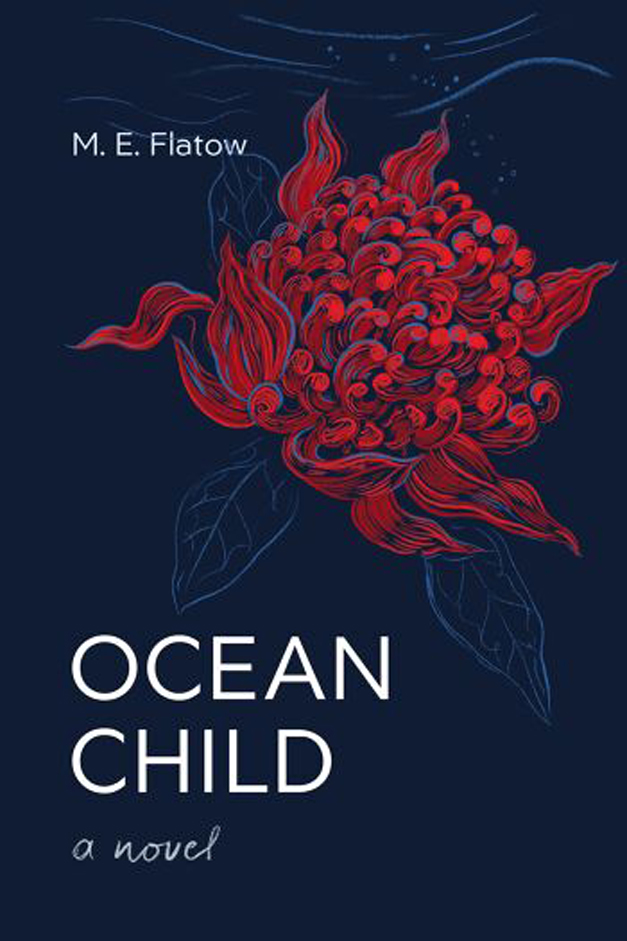
Ocean Child
Author’s statement: “Working with cover designer Zuza Miśko, we designed Ocean Child to pop in digital spaces: a crimson waratah on deep navy with large, clean typography that stays legible at thumbnail size and in dark-mode feeds. The composition uses high contrast and generous negative space to survive platform crops, and to stop the scroll.”
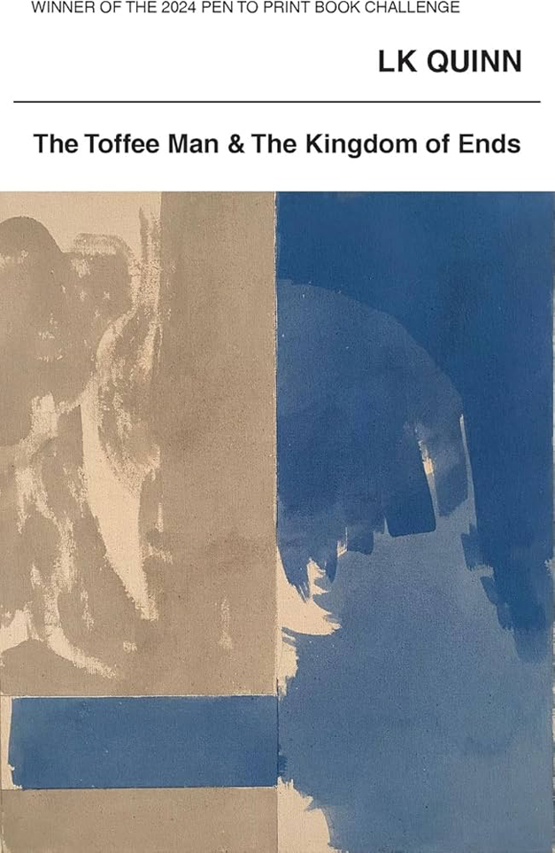
The Toffee Man & the Kingdom of Ends
Author/designer statement: “I was drawn to the work of the artist, Peter Joseph, early in my life. I was honored when he gave permission to use this painting for the book cover—the subtle dynamics of which I felt captured the spirit of the young protagonist, April.”
VINTAGE
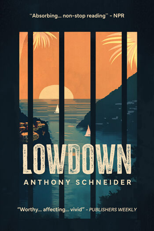
Lowdown
Author’s statement: “I wanted a cover that captures the crazy, contradictory lives of the novel’s two main characters. For part of the book, one character endures a cold prison cell in America, while the other is on the run in bountiful, beautiful Sicily. I hit upon the idea of looking out at an idyllic coastline through prison bars, and designer Katarina Naskovksky brought it to life.”
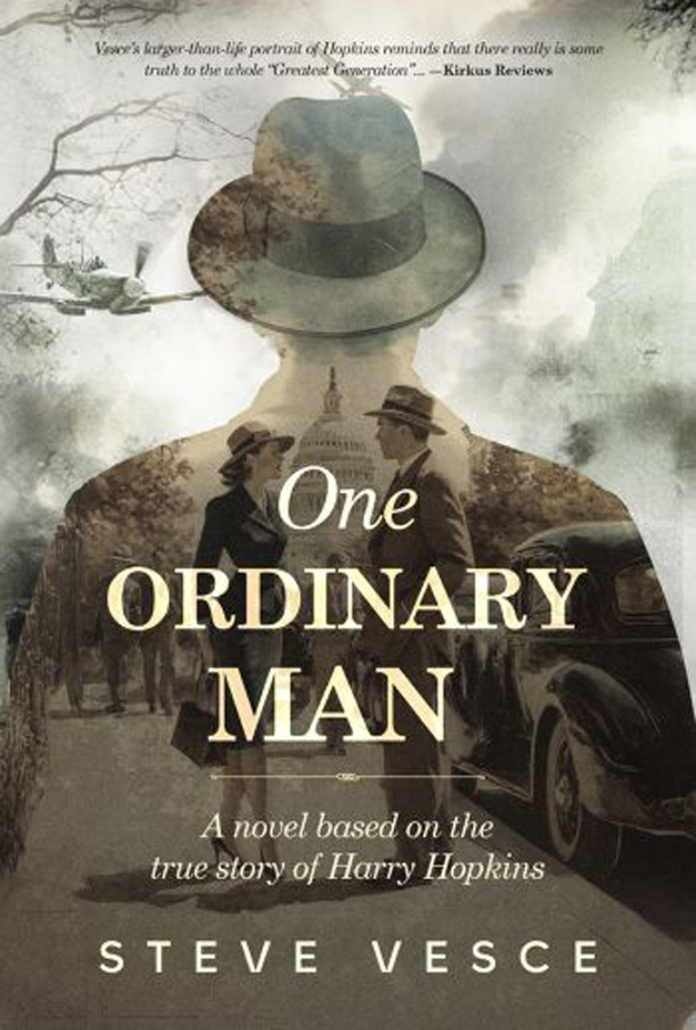
One Ordinary Man
Author’s statement: “The cover’s atmosphere—shaped by the colors, tones, and hazy images of the capitol, fighter plane, smoke-filled London, and the two men walking—give readers a sense of the story’s subject and time period.”
GEOMETRIC
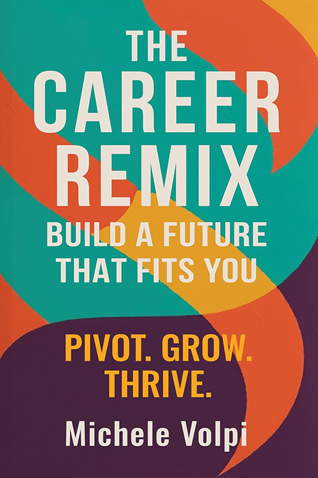
The Career Remix
Author’s statement: “I wanted the cover to visually express the idea of reimagining one’s career with energy and optimism. The bold orange, teal, and purple palette symbolizes transformation and growth, while the clean, modern layout was designed to resonate with Millennials and Gen Z professionals.”
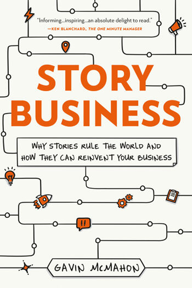
Story Business
Author’s statement: “The cover visualizes a core idea of the book: stories move people and people move business. The pathways and bright orange icons form a simple but high-contrast map of how ideas travel and connect, with small details meant to pull the reader in.”